UX/UI Design
The Story of An Educational app named Vis-Deck
This is an educational app; it has been designed to help the Autistic community better interpret body langue and what emotions they are expressing.
Engagement is one of the most difficult aspects of teaching, by utilizing Intellectual properties such as Superman, the students are more excited about the lessons, and they relate better to the material.
My Roles:
UX/UI Designer - User Research, Research Analysis, Product Strategy, User Flows, Interaction Design, Low- and Mid-Fidelity Prototyping, and User Testing
CLICKABLE PROTOTYPE

Overview
The CHALLENGE
Most of the school curriculum for these lessons are designed very young children, they are perceived as condescending by young adults who are also learning these skills. The IPs we choose will appeal to most age groups, so young adults can chose IPs that better reflect their current interests.
The Solution
This is an educational app built around some of our favorite Intellectual Properties. Engagement is one the most difficult aspects of teaching, by utilizing IPs such as Superman, the students are more excited about the lesson and they relate better to the material. It makes these types of repudiative lessons more enjoyable and relatable for the students.
Define
Client & User Goals
• Create more engagement by allowing users to enjoy their fandom.
• Help make this app more approachable for users over the age of 10.
• Reduce confusion and distraction by limiting the amount of choices.
• Help users better understand non-verbal communication.
User Research
To Better define my path to I conducted user research, both Quantitative and Qualitative. The initial survey was completed by 14 users and I interviewed 3 individuals in person.
Quantitative Research
14 Responses
Main Goals and conclusions:
01 - Why would you use this app?
• To help teach my child to identify emotions
• So my Special ed students can enjoy their lessons
02 - How often do you use apps to refine a skill set?
• Once to twice a day
03 - Negative experiences
• Condescending
• Boring
04 - Favorite educational app
• Kahoot!
Qualitative Research
3 Interviews
Main Goals and conclusions:
01 - Negative aspect of learning apps
• Poor quality, not refined
• Not enjoyable
• Small buttons
02 - Most Important Information
• Emotions expressed in a relatable way
• Treat users like a person not a child
• Easy to use buttons
03 - Why would you use this app?
• To help my son better identify emotions
• Mobile apps allow my students to learn anywhere
Key Takeaways From User Research
01 - Focus on accessibility
02 - A design approach that appeals to both kids and adults
03 - Us engaging images and IPs
Competitive Analysis
Strategy
Based on the data collected during my research phase, i created 2 personas that express behaviors, goals, and desires of the typical bus user.
Information Architecture
User Stories
To identify and prioritize the functions of the Vis-Deck app I created stories based off real world situations and the persona’s needs.
• What learning app will better engage my students
• I’m an adult, don’t treat me like a child
• I need more than three lessons about emotions
User Flows
I created user flows to help visualize the path a user would through the app to find specific information.
User Story: How do I play a deck and how can i get more
Site Map
After creating the user flow i then built out a site map to better organize my screens and further define my hierarchy.
Low Fidelity Wireframes
This is when I started to “sketch” out the app’s low fidelity wireframes based off my user story, user flow, and the site map.
Digital WIREFRAMES - Low Fi
The goal was to generate an easy and efficient way to find data on a specific Bus.
Primary feedback was:
• Remove 3 buttons and replace with hamburger menu
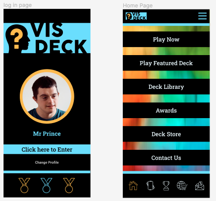
• Replace bottom nav text with Icons
• Final screen should have a “next” button.
Branding & Identity
My primary goal for branding was to create visual experience that expresses the Autism Awareness movement and use blue hues due to their calming nature.
The Vis-Deck Color Pallet
I based this app’s color pallet of of the of the preexisting hues from Autism Awareness and a base in blue hues, these colors have been adjust to maximize accessibility.
The Vis-Deck Icons & Fonts
I I created a collection of Icons to represent: Home, Deck Library, Awards, Store, and Contact Us
Logo Creation
This logo concept represents questions and where to find the answers.
Visual Design
Final Prototype
The feedback has been prioritized and addressed while the style reflects the TOLB branding .
Clickable Prototype
Final User Testing Results
01 - Were the users able to find and purchase a Powerpuff Girl Deck?
They all were able to find and buy this deck.
02 - How intuitive was their journey?
The App was easy to navigate and the large buttons are a big help.
03 - Was there anything that confused the user?
The Icons and menus were easy to understand.
04 - What was the most commonly used path to find contact us?
The icon based navigation.
What I Learned
The Flat Graphic Approach
At first i was concerned that this flat color approach would confuse users, users might not identify buttons or other or navigation tools, After speaking to a senior mobile game producer i was assured that users and apps have already been implemented and the learning curve would be low to none. As I was testing my prototype that rang true, users were able to easily use and navigate this app.
The UX/UI process
Throughout this processes I gained a better understanding of testing and an iterative design approach, testing really helped me understand the users and their needs. This resulted in a more refined product that speaks directly to the intended users’ desires, while maintaining optimal accesability.


