UX/UI Design
The Story of a Bus App called TOLB
The city of Toledo has currently re-invented their brand and services to better represent the city and to better serve its citizens. I took this opportunity to create a new transit app that would reflect the look of the city and provide the bus users with less pain point and more functionality.
The Goal for this project is to not only create a functional app, but to streamline the user’s journey and provide them with quick access to vital transit data. It will reflect the city’s newest look while providing the reliability and functionality that Toledo’s commuters deserve.
My Roles:
UX/UI Designer - User Research, Research Analysis, Product Strategy, User Flows, Interaction Design, Low- and Mid-Fidelity Prototyping, and User Testing
Clickable Prototype

Overview
The CHALLENGE
The current and most used methodology requires visiting the official TARTA website and utilize their “plan a Trip” function. They do offer a TARTA App but its failure rate is high and it’s satisfaction rating is low (1 star out of 5) I would go into
additional details but the app would not open on any of the 4 smart devices I tested.
The Solution
The Goal for this project is to not only create a functional app, but to streamline the user’s journey and provide them with quick access to vital transit data. It will reflect the city’s newest look while providing the reliability and functionality that Toledo’s commuters deserve.
Define
Client & User Goals
• Create more certainty around bus schedules.
• Help user arrive at bus stops in time for their bus.
• Reduce confusion when 2 or more buses service the same stop.
• Better organized and updated Information.
User Research
To Better define my path to I conducted user research, both Quantitative and Qualitative. The initial survey was completed by 21 bus users and I interviewed 3 individuals in person.
Quantitative Research
21 Responses
Main Goals and conclusions:
01 - Why they use the bus
• To avoid Parking Issues
• Accommodate large groups
• Commuting
• Site Seeing
02 - How often
• Every work day to once a year
03 - Negative experiences
• Missing buses
• Getting lost
• Lack of handicap access
• Safety
04 - Favorite transit App
• Google Maps
• Candy Crush???
Qualitative Research
3 Interviews
Main Goals and conclusions:
01 - Negative aspect of bus travel
• Not always ADA compliant
• Confusing process
• Accessing updated schedules
02 - Most Important Information
• Where the buses are going
• What are the stops
• Maps are helpful
• Reminders
03 - Why do you take the bus?
• To avoid parking fees
• Needing more room for a large amount of people
Key Takeaways From User Research
01 - Access to update schedules
02 - locating bus stops near me
03 - Live tracking on maps
Competitive Analysis
Strategy
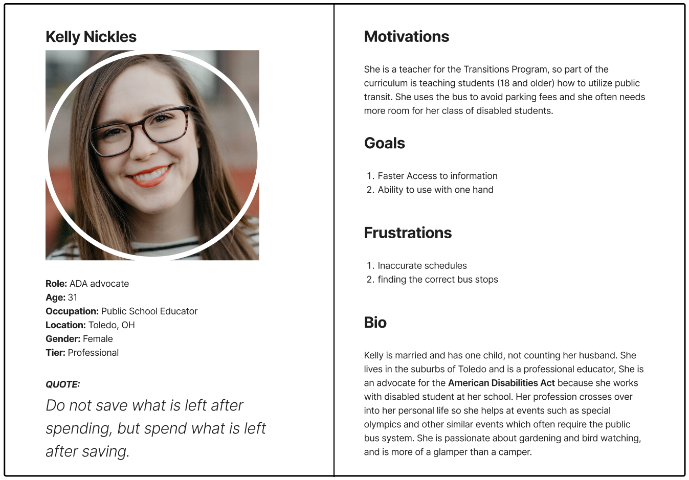
Based on the data collected during my research phase, i created 2 personas that express behaviors, goals, and desires of the typical bus user.
Information Architecture
User Stories
To identify and prioritize the functions of the TOLB bus app I created stories based off real world situations and the persona’s needs.
• Where the buses right now
• What bus stops are closest to me
• How can I find a specific bus and its route
User Flows
I created user flows to help visualize the path a user would through the app to find specific information.
User Story: Locate the schedule for either a bus or a bus stop
Site Map
After creating the user flow i then built out a site map to better organize my screens and further define my hierarchy.
Low Fidelity Wireframes
This is when I started to “sketch” out the app’s low fidelity wireframes based off my user story, user flow, and the site map.
Digital WIREFRAMES - Low Fi
The goal was to generate an easy and efficient way to find data on a specific Bus.
Primary feedback was:
• Remove 3 buttons and replace with hamburger menu
• Replace bottom nav text with Icons
• Final screen should list all stops for the bus.
Digital WIREFRAMES - Mid Fi
My second set of wire frames addressed the previous feedback as well as highlighting additional
elements that should also be addressed.
Primary feedback was:
• Indicate which App section we are in
• Add further clarity to final page
• Show and define additional icons to the live map tracking.
Branding & Identity
My primary goal for branding was to create visual experience that would add validity and invoke trust amongst the Toledo users. This year the city of Toledo has released and implemented their new style guide and how it is being applied to city’s messaging and the face of their transit system.
Toledo’s Color Pallet
I based this app’s color pallet of of the of the preexisting hues from toledo’s new style guide. I did adjust the hues slightly to generate enough contrast to meet accessibility standards.
TOLBs’ Color Pallet
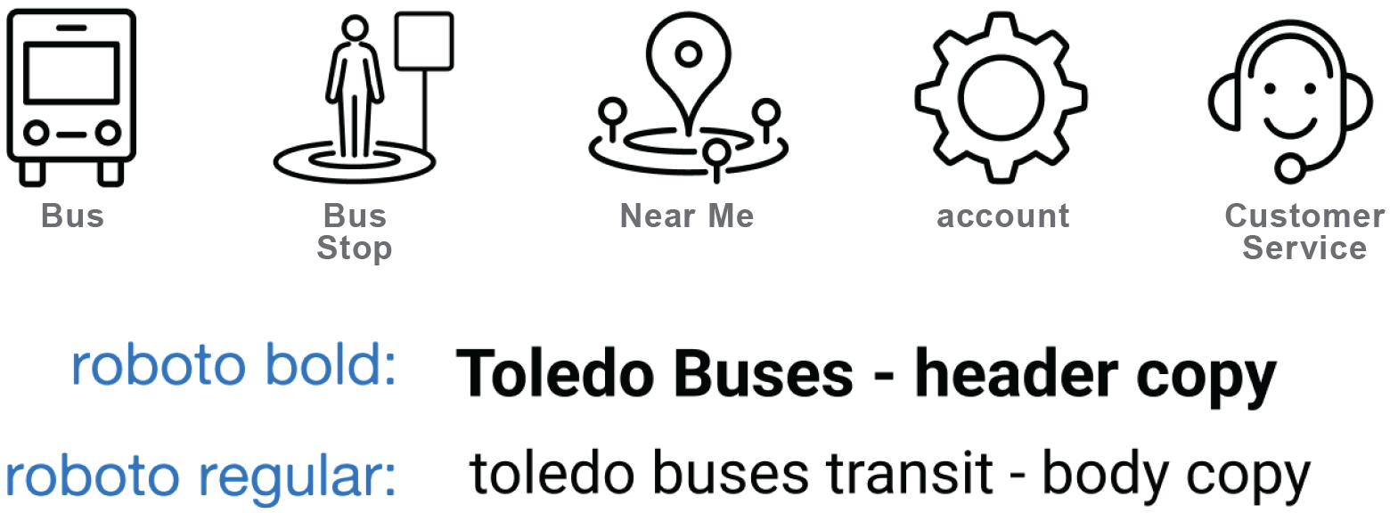
Here is the adjusted color pallet for the bus app, the supporting Icons, and the font choices.
Logo Creation
This logo concept represents a journey, The simple act of lining up to get onto a bus. It conveys the Apps tracking function by incorporating the Live Location icon which is highlights the User as they board the bus.
Visual Design
Final Prototype
The feedback has been prioritized and addressed while the style reflects the TOLB branding .
Clickable Prototype
Final User Testing Results
01 - Were the users able to find specific information abou bus 1?
They all were able to find Bus 1 and the information they needed to know.
02 - How intuitive was their journey?
The App was easy to navigate, bonus feature, I only needed one hand to find my info.
03 - Was there anything that confused the user?
The Icons and menus were easy to understand.
04 - What was the most commonly used path to find bus 1?
The Search Bar.
What I Learned
The Search Bar
The search bar was the most commonly used form of navigation for first time users, but it is also the slowest path to the information the users are seeking. Only one of the three final testers used the icons and they were able to navigate the app with one hand.
The UX/UI process
Throughout this processes I gained a better understanding of testing and an iterative design approach, testing really helped me understand the users and their needs. This resulted in a more refined product that speaks directly to the users’ desires instead of


